
- Regular Price
- $19.99
- Sale Price
- $19.99
- Regular Price
- $19.99
Sold Out
- Unit Price
- per

We’ve all looked at an image that simply feels expensive — clean, balanced, and full of quiet confidence. But what exactly makes a photograph or visual look “premium”? It’s not just the camera or the subject; it’s the subtle choices behind composition, light, color, and texture. Understanding these visual principles can elevate any image — whether it’s a product photo, flat lay, or lifestyle shot.
Premium visuals often share one thing in common: intentional simplicity.
They rely on balance, space, and storytelling rather than clutter or filters. Elements like texture, tone, and light work together to communicate elegance. When an image is thoughtfully composed, our eyes rest easily — a hallmark of sophistication.

Lighting defines mood more than any other element.
Soft, diffused light adds warmth and realism.
Golden hour tones enhance natural textures.
Shadows bring depth and mystery.
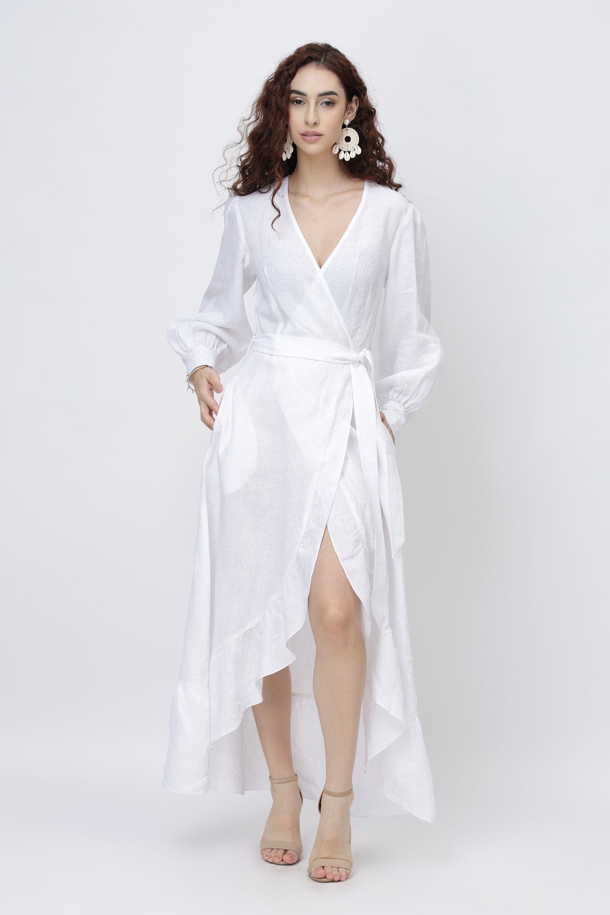
Premium photography uses light as a brush — never too harsh, never too flat. You can see this in lifestyle lookbooks where linen drapes or organic fabrics glow naturally under sunlight, creating dimension without over-editing.
Good images breathe. Negative space — the “empty” area around the subject — gives photos a sense of calm and focus.
The rule of thirds, leading lines, and symmetry subtly guide the viewer’s eyes, creating flow and intention. Too many elements create noise; premium visuals rely on what’s left out as much as what’s included.
Texture adds authenticity. You can feel the softness of fabric or the crisp edge of a linen fold when tones are true to life.
Premium images often feature muted or natural color palettes — soft whites, creams, browns, and gentle blues — because they evoke calmness and timeless appeal.
For example, when photographing textiles or accessories, maintaining natural hues over artificial filters helps your product appear elegant and honest.

Every premium photograph tells a story without shouting. The emotion behind it — calm, confident, effortless — connects the viewer to the image. This emotional link is what transforms photography from content into art.
What makes an image feel premium isn’t luxury — it’s intentional design. When light, tone, and emotion align, even the simplest subject can look elevated. The beauty lies in restraint, natural tones, and storytelling through detail.
It’s one that feels balanced, calm, and intentional — free from visual noise or over-editing.
Because light shapes how we perceive texture, depth, and quality. Soft, natural light always enhances authenticity.
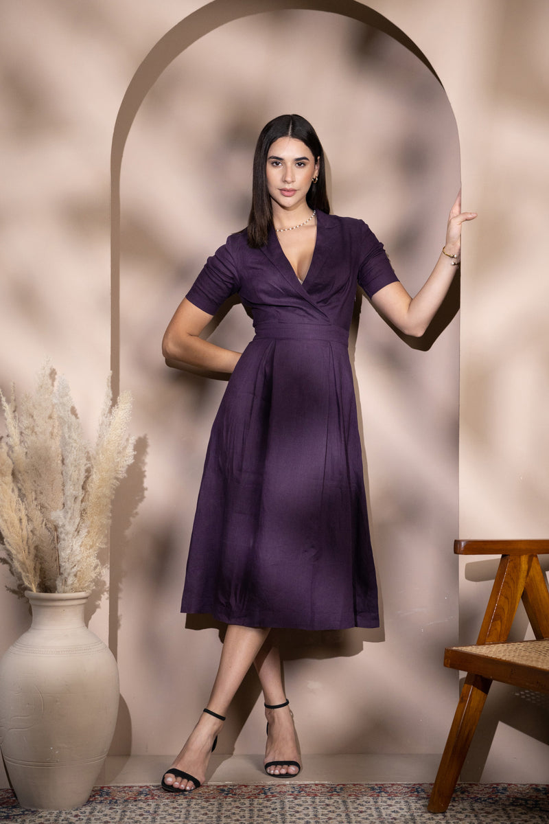
Use neutral backgrounds, consistent tones, and plenty of negative space. Let your product breathe.
Whites, beiges, muted blues, soft greys, and natural browns — tones that reflect simplicity and warmth.






0 comments